Brand | 5-15-2024
Timeless style
Buick celebrates its 120th anniversary with new logo
Instantly recognizable, Buick’s tri-shield logo has come to symbolize premium transportation for the better part of a century.
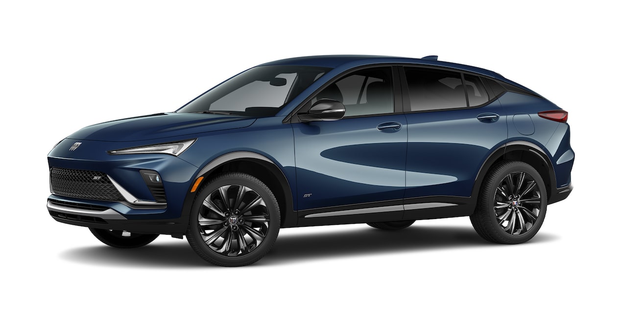
The famous tri-shield was recently updated to highlight a sleeker, more modern look representing Buick’s future. Fittingly, the new emblem first appeared on the all-electric Buick Wildcat concept vehicle
B magazine reached out to the GM Heritage Center to learn more about the logo’s evolution, from its earliest depictions through today.
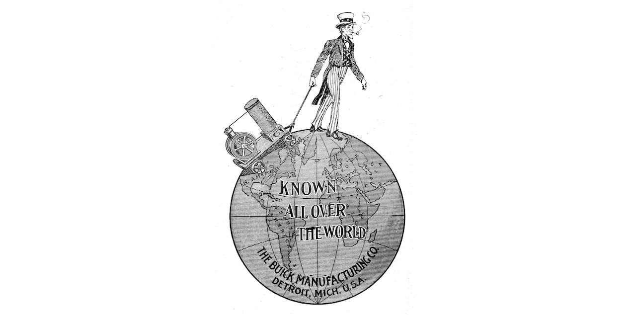
1903
Buick’s first representation features Uncle Sam traversing the globe. The logo calls out Buick’s hometown of Detroit, but a new version is soon released to reflect the brand’s updated name — Buick Motor Company — and move to Flint, Michigan, the same year.
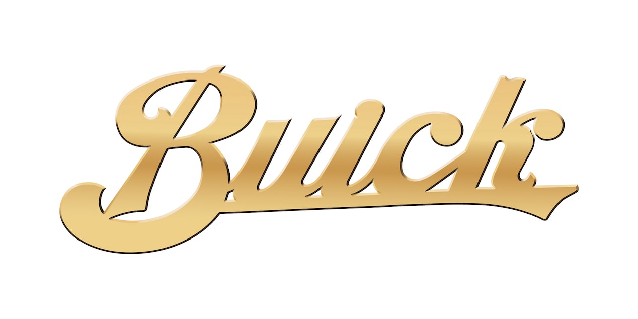
1905
The branding is reintroduced with a series of script logos, including an elegant gold design based on David Dunbar Buick’s signature.
1913
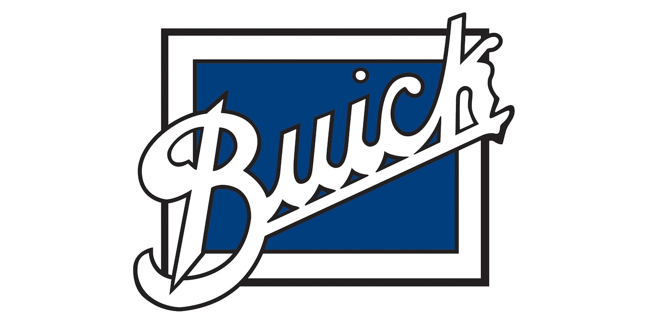
With a bright blue square as a backdrop, this Buick logo lasts throughout the Roaring Twenties. Still incorporating the Buick name, the classic, cursive font remains front and center.
1937
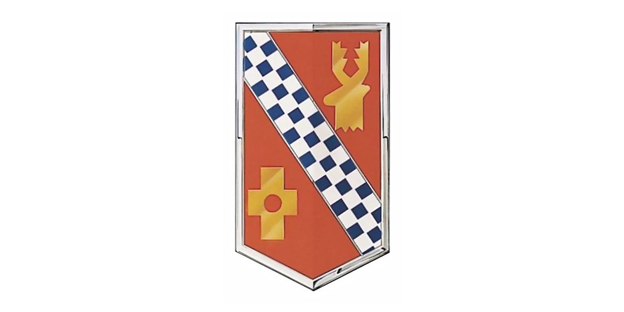
Inspired by David Dunbar Buick’s family crest, the first Buick shield incorporates the Scottish coat of arms for the family name (spelled “Buik” at the time). The shield features a diagonal, blue-and-silver checkered banner, a gold buck’s head and a gold cross with a hole in the center.
1939
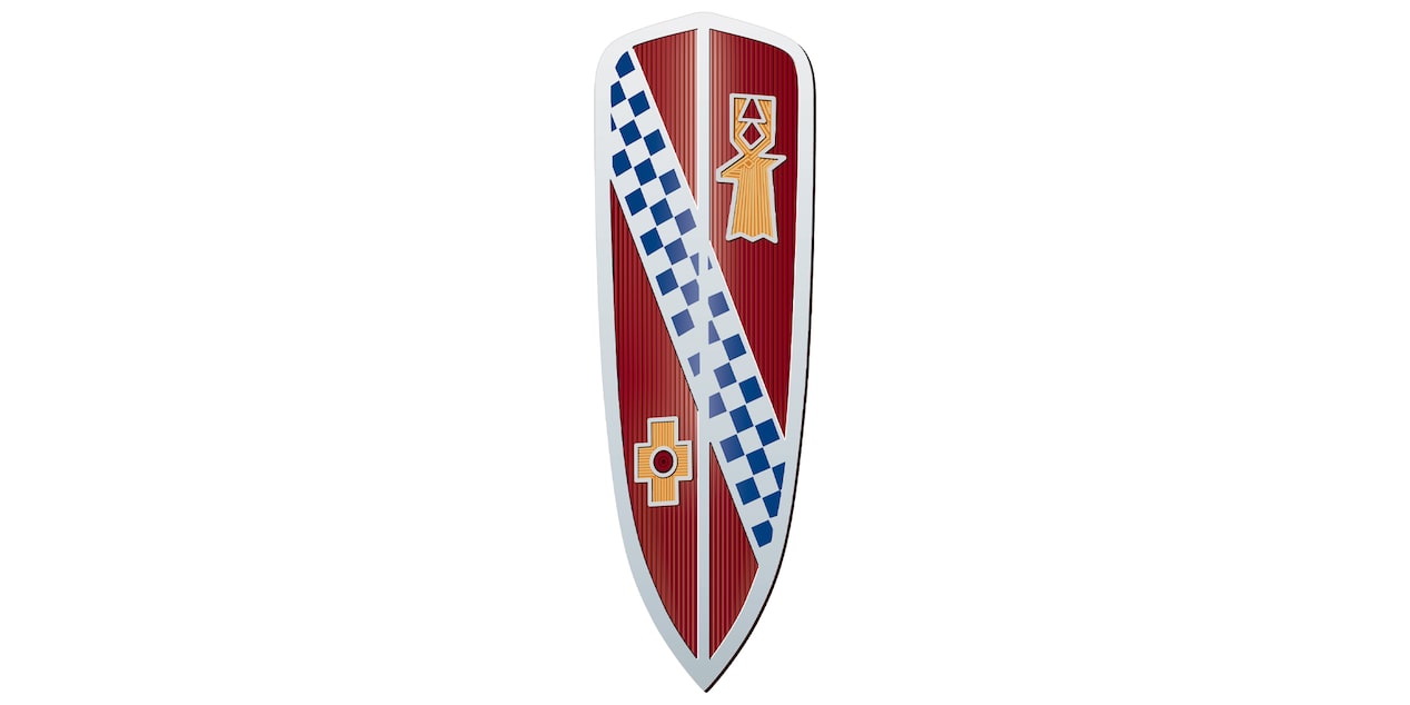
An updated version of the shield appears a few years later with an elongated shape more similar to the modern shields. The logo is refreshed to look three dimensional and features added texture to its elements.
1959
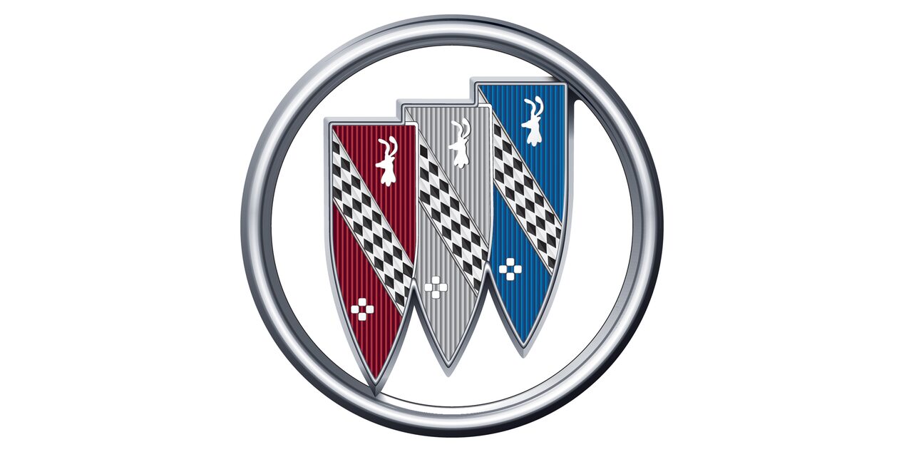
The iconic red, white and blue tri-shield logo debuts with the redesigned, but familiar, family-crest elements encircled in a ring. The new logo’s shields coincide with the brand’s new Electra, Invicta and LeSabre lines and the production of Buick’s 10-millionth vehicle.
1975
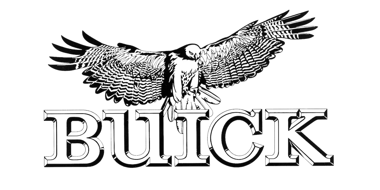
A new logo concept, the Buick Hawk, soars onto the scene when the Buick Skyhawk line is launched. It’s so well-received by the public that it’s expanded to all car lines, although the tri-shield remains in use as well.
1990
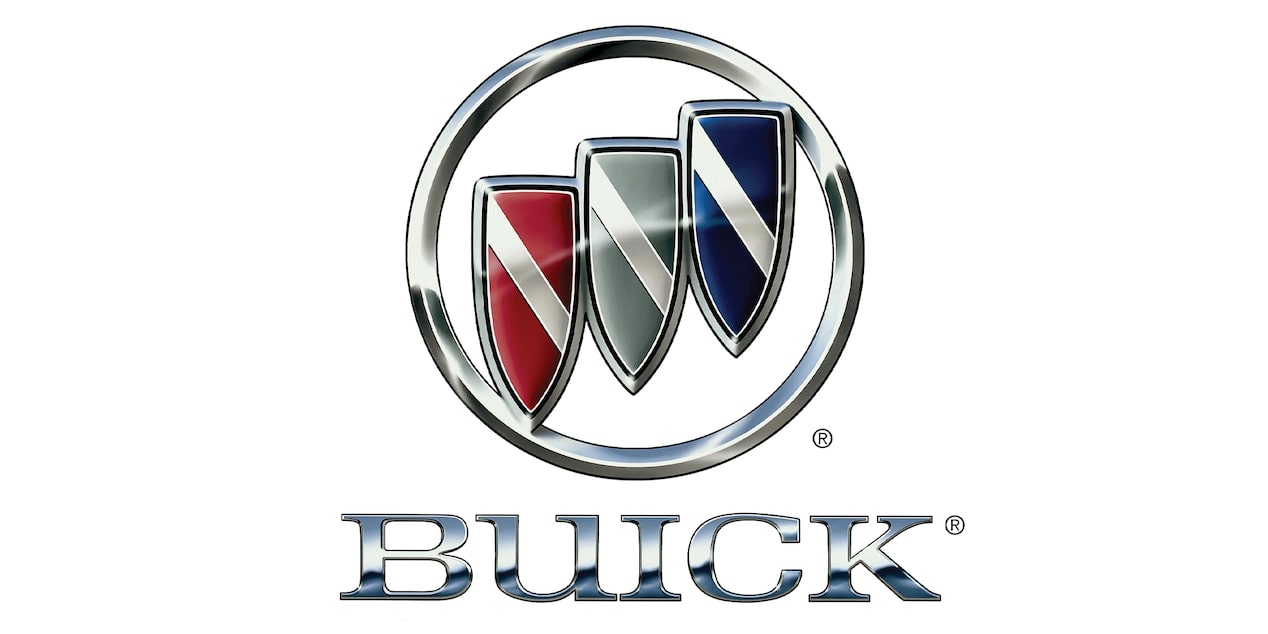
The Buick tri-shield returns with a straightforward, more modern look, retaining the silver banner running through each shield. The shields remain in a silver circle, but now the nameplate features a bold, all-caps BUICK underneath it.
2016
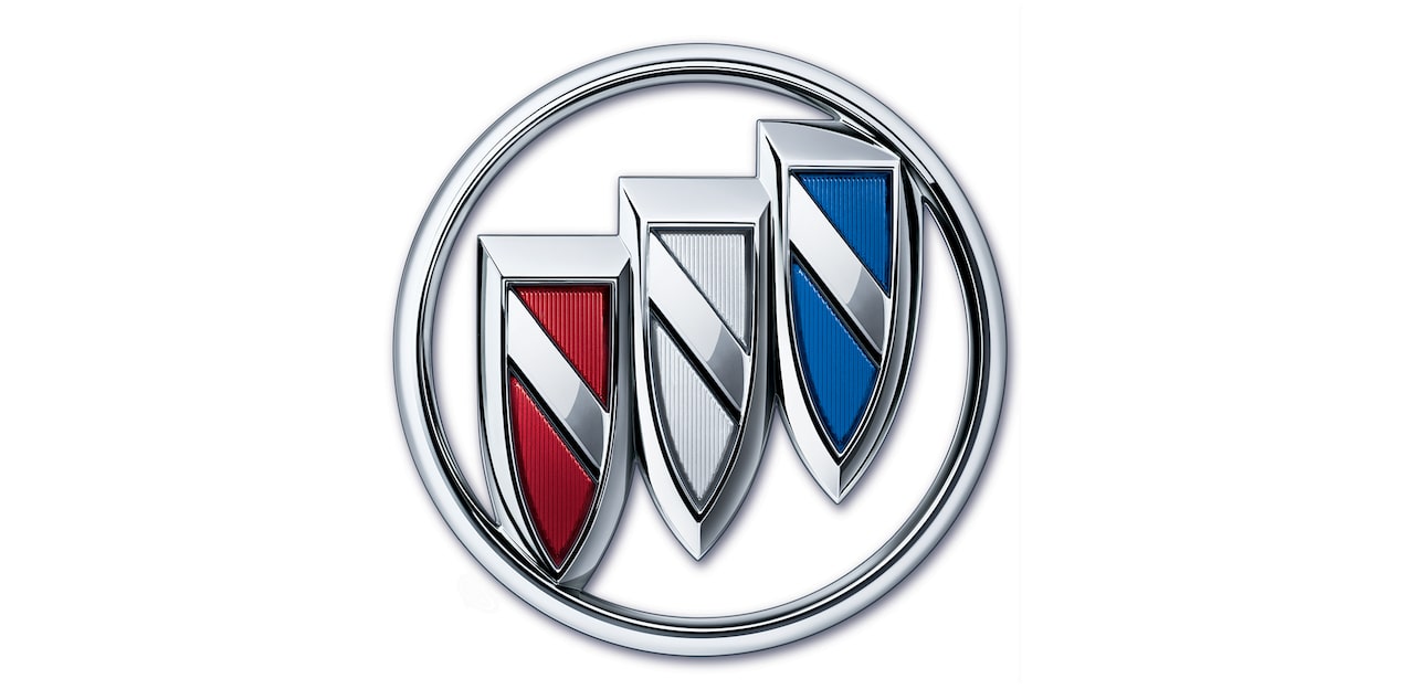
After going completely silver in the early 2000s, the Buick logo returns to its red, white and blue identity with subtle updates to give it a slightly bolder appearance.
2022
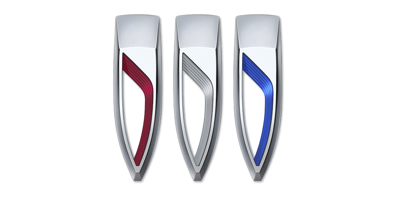
In the first major logo redesign since the 1990s, the newest Buick branding features the three shields positioned horizontally, reflecting the fluid movement of future vehicle design. The sleeker shields with just a touch of color maintain the tri-shield heritage while also ushering in a new era.
“We’re always looking at what’s new and what’s next, developing new ideas, it’s a pretty big deal to change a brand logo, but the Wildcat show car really opened the door — a launchpad for going electric and for leadership to say it’s a good time to do this, where it represents a new direction for where Buick is going.”
- David Haskell, Creative Designer for Buick Brand Identity
The new logo’s design reflects the collaboration of designers going back about six years, says Anne-Marie Laverge-Webb, Design Manager for Brand Identity and Graphics. “We really pulled in a lot of different perspectives,” Laverge-Webb says. “We started socializing it with some of the iconic elements, including the sequence of three (shields), maintaining the color cues. We wanted to maintain the brand equity, but with a fresh and contemporary evolution. It really has a lot of beautiful features to it.”
After initially removing the silver ring around the shields, the team designed the shields in a horizontal line with a diagonal sash-type angle in each. Sleek and dynamic, the soft curves showcase motion with a depth highlighted by jewel-like color inserts.
Materials were an important consideration for depicting the logo in vehicle badging, as the team worked to provide texture, reflection, depth of color and even a soft-glow lighting element that will appear on vehicles at a later time. A hand-drawn “Buick” signature also was designed to accompany the logo with a modern tone.
Your elevated experience awaits
More stories
Immerse yourself in Buick. Check out new vehicle announcements, helpful information and exciting stories.


